When you’re starting your business, you spend a lot of time considering your brand. You want to find a name that fits just right and design a logo that represents the essence of who you are and what you do.
Once it’s out in the world, though, it’s tougher to protect that beautiful brand you’ve created. You want people to talk about your business, but what happens when they mispronounce your name? Or perhaps they post about your product on their blog, but change up your logo to match the color scheme on their website. Or maybe you sponsor an event, only to arrive on the day and find that your logo has been truncated on the signage the hosts created. These are the kinds of branding no-nos that make every marketer cringe.
So what can you do to ensure that your brand continues to be represented properly as your name spreads far and wide? That’s where a brand style guide comes in.
Brand style guides provide parameters for how anyone reproduces your brand’s name or image elsewhere. Here’s how to create a solid brand style guide that keeps your business looking professional and consistent out there in the big world.
Present How to Use Your Name
Some businesses have pretty straightforward names (Whole Foods, for example, is a tough one to mess up). But other brands have names that are a little less clear-cut. Some brands have created words for their name, while others have stylized ways they’d like their name represented.
When it comes to making sure your name is used correctly, it’s helpful to simply let people know how you’d like it used. Sometimes the easiest way to do this is to start with the story behind the name. What seems like a hard-to-remember brand name might become easier to get a handle on if your audience knows the why behind it.
Even if you don’t have the time or space to give your full story, there’s still an opportunity to educate the public on how to use your name. For example, Greek yogurt brand Fage includes the note “It’s pronounced FA-YEH” on all of their cartons of yogurt. While there’s not enough room on a little tin of yogurt to tell the whole story, they’re at least getting the basics of proper pronunciation out there.
It can also be helpful to address common misuses. This might be pronunciation-related, or it might be the way your name is stylized. For example, it’s Walmart, not WalMart or WalMART. This is a particular struggle for brands who have created their own name or use a combination of words as their name. It’s also relevant if your name incorporates a common phrase that itself is often misused (We’ve had some intrepid searchers over the years looking for Duck Tape Marketing online).
Simply by taking some time on your website and other online assets to give the backstory to your name and demonstrating consistently how you’d like it to be stylized, you can eliminate much of this confusion.
Explain How Your Logo Should Be Used
There’s a lot that goes into designing a logo. Selecting the right imagery, type face, color palette and more takes a lot of time. It’s also common for brands to create several approved versions of their logos. There’s the full logo that you use at the top of your website and in the banners on your social media profiles, but then you might have a smaller, modified logo that you use as the little round profile picture on your Twitter or Instagram profile.
But just because you have a few approved versions of your logo doesn’t mean that people are now free to get creative with your branding and do whatever they’d like. You need to outline how you’d like your logo to represent your brand. That way, your marketing team and anyone else who might use your logo to promote your brand knows what’s allowed and what’s not.
Define the Approved Colors
No matter how many versions of your logo you choose to create, it’s up to you to set the colors you’d like to be used.
Consider a brand like Target. Their bullseye logo is instantly recognizable in their signature red. But if it was yellow or blue, you’d be left scratching your head. They’ve set clear brand guidelines that their logo is to be produced with red logo on white background or white logo on red background, and not any other variation.
Other brands are more flexible with the color palette they use for their logo. The Nike swoosh, for instance, is one that we’ve seen in a variety of colors. They sometimes show it as a black swoosh on white background, sometimes vice versa. And other times it’s another color, like red. A brand like Nike can afford to be a little more flexible with their color palette, because their logo itself is so well-known. It doesn’t matter what color the swoosh is; consumers instantly know it’s Nike.

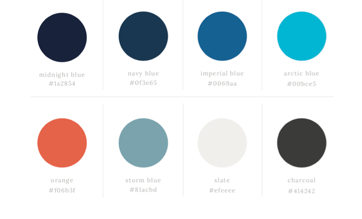
At Duct Tape Marketing, we settled on a palette with a variety of shades of blue, plus a complementary pop of orange. The black and white elements of our logo and accompanying design elements are not pure white or black—instead we opted for a grey-white called slate and a dark grey charcoal.
No matter what colors you choose for your brand, it is up to you to set approved colors. Make it clear that it’s only your logo if it appears in one of the colors you’ve outlined in your brand style guide.
Clarify Fonts
Fonts are another area where sometimes others try to get creative with your logo. However, as with your color palette, you selected your font for a reason. It conveys the proper attitude for your brand, and if someone’s going to reproduce your logo, they need to use the font you’ve set forth.
It’s not just about the font itself, it’s also important you dictate the size of the font, particularly as it relates to other design elements on the page or within the logo itself. Guaranteeing consistency in font size, placement, and style will make your logo more easily recognizable by consumers.

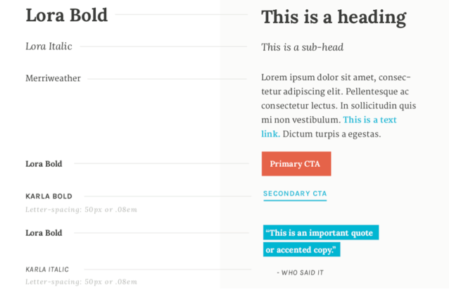
This is the font guide we’ve created for Duct Tape Marketing. As you can see, there are three different fonts that we use in a variety of styles, depending on the occasion. In our style guide, we clearly outline how to use each font, and how the elements should relate to each other on the page.
You Set the Mood
When you’re talking about the individual design elements that go into your logo, what you’re really dictating is the mood of your logo—its look and feel. Much has been written about the psychological influence of using certain colors. While there’s not a lot of scientific evidence about how colors influence our buying behaviors, it’s undeniable that we associate certain colors with particular emotions.
For example, someone starting a children’s toy company likely wouldn’t opt for a grey-scale logo. They’d want to pick “fun” colors. Something in bright orange or yellow would be more appropriate to connote the excitement children will feel when they engage with those products. The font might be something light and whimsical that bounces across the page.
On the flip side, a neon-bright logo would not be the first choice for a law firm. Lawyers want to convey their knowledge, expertise, and gravitas with their logo, so they might opt for something in a darker color palette and with a heavy, imposing serif font.
Establish Your Brand Voice
Once you’ve gotten clear on how you’d like your logo and name to be presented, you can broaden it out to talk more about your brand voice. This brand style guidance is most applicable for people who will be writing representing your brand. Whether that’s someone on your marketing or sales team, or an outside writer that you tap to help with your content, giving guidelines for your brand voice can help to maintain consistency across all of your messaging.
This is a great place to establish your brand’s personality traits. Do you want to be approachable and down-to-earth? Is the aim to appear authoritative and commanding? Of course, your brand’s personality will vary based on industry and area of focus.
It also pays to provide concrete examples for how you’d like this personality to be expressed. For example, is it okay for writers to use contractions in their communications, or would you prefer to keep things more formal? Are there specific words you’d like writers to either avoid or embrace? These granular guidelines can help keep everyone on the same page.
If there are words or phrases that are particular to your brand, it’s also a good idea to define how you’d like them referred to. For example, McDonald’s is clear on the name of their signature burger, the Big Mac. You don’t see them calling it the Big Mac on store signage and then referring to it as the Big McDonald’s on social media! Make sure that all of your branded words and phrases, not just your logo and business name, are set in stone and consistent across all marketing materials.
Include Supporting Visuals
When it comes to representing your brand, it’s not just about your logo. It’s about the kinds of visuals you use across your brand’s platforms and how they represent you as a business.
Set clear guidelines for those who might be creating images to accompany content for your brand. For example, if your brand relies heavily on cartoon images on your website, perhaps you’d like that same aesthetic mirrored across your social media channels. Maybe the images on your website all have a sepia-tone to them, and bright, hyper-edited photos would feel out of place in other representations of your brand online.
Whatever the case may be, clearly spell out what you expect to see when it comes to other visuals associated with your brand. It’s even nice to provide a gallery of approved images, so that people can either pull from that gallery directly or use it to inform their work as they select their own images.
Pulling together your brand style guide is a necessary part of ensuring that your business’s image remains consistent out there in the world. You spent a lot of time thinking about how best to represent your identity, mission, and customers, and you want to be sure others adhere to the guidelines you’ve established.
If you’re looking for a helpful tool, Canva makes it easy for brands to create a kit with their established logos, colors, and fonts so that it’s easy to share with designers, writers, partners, and others who might be creating content for your brand.

